How to add a pop-up form to your website without a developer
How to add a pop-up form to your website without a developer: when to open it, how often to show it and what to ask. stepFORM data and a step-by-step setup.
Forms  Daria Lisovenko
30 September 2026
Reading time ≈ 14 min.
Daria Lisovenko
30 September 2026
Reading time ≈ 14 min.
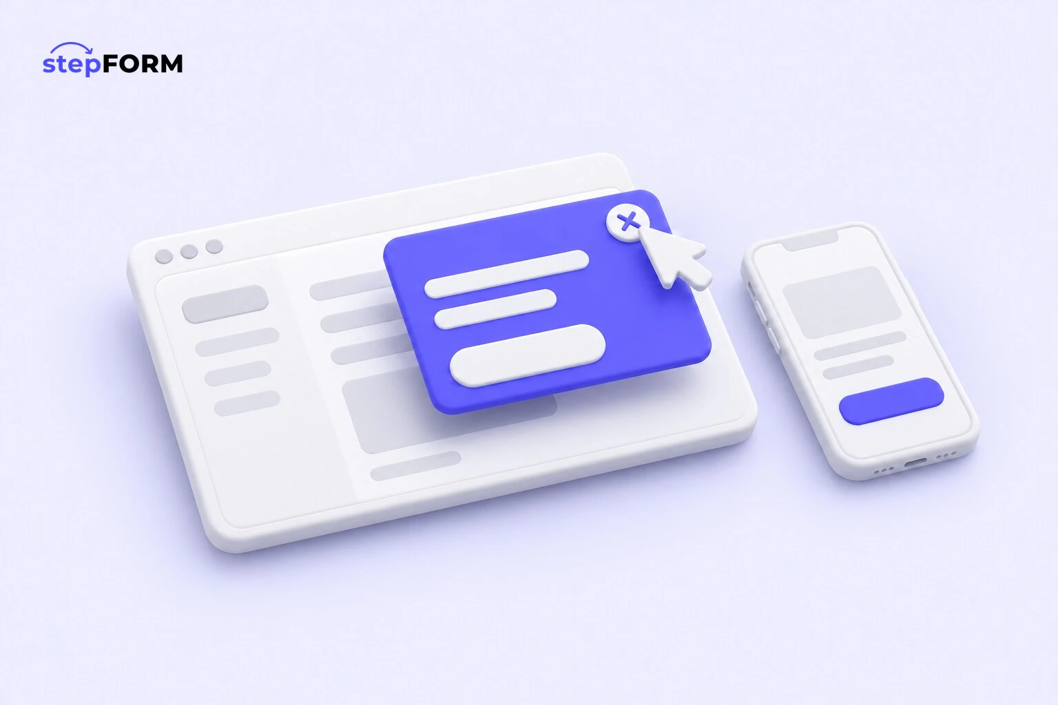
A pop-up form is a form that opens on top of the page: as the page loads, after a few seconds, when someone tries to close the tab or when they click a button. You can add one without a developer. Build the form in a form builder, choose the POPUP publishing method and paste the code into your site before the closing body tag.
The harder part is deciding when to open it and how many times to show it. We looked at the settings of stepFORM forms that open on their own and received responses over the last year. 63% of them pop up as soon as the page loads, and 70% appear every time. Those are the most intrusive options available, while only 7% of these pop-ups wait for the moment people try to leave.
A pop-up or a form on the page
Not every page needs a pop-up. On a contact or pricing page the form is already in view, and a window on top of it only gets in the way. A pop-up helps where there is no form or it sits far down: in a catalogue, on a blog, on a long service page where people are still reading and have not decided whether to call you.
You can show the same form both ways: as a block on the contact page and as a pop-up from a button in the header. Responses from both places land in one account and trigger the same notifications, so you do not need a separate form for the pop-up. And if a landing page already has a form on its first screen, the exit pop-up should offer something different, such as a shortlist or a quote instead of the same callback.
When to open a pop-up
There are four ways, and the choice decides whether people see the window as help or as a nuisance.
| Trigger | When it fits | The risk |
|---|---|---|
| As the page loads | An announcement that matters more than the page itself: a one-day offer, new opening hours | The window covers the page before people know where they are. On a phone it fills the whole screen |
| After a delay | Long pages: a catalogue, a price list, an article. Half a minute is enough to tell whether the page is relevant | A very short delay is no different from opening at once |
| When the tab is closing | A last chance: a discount, a shortlist, "we will call you back in 15 minutes" | Fewer views. Then again, only people who were leaving anyway see it |
| On a button click | "Request a call", "Get a quote", "Book now": the person has already decided to get in touch | Hardly any, as long as the button is easy to see |
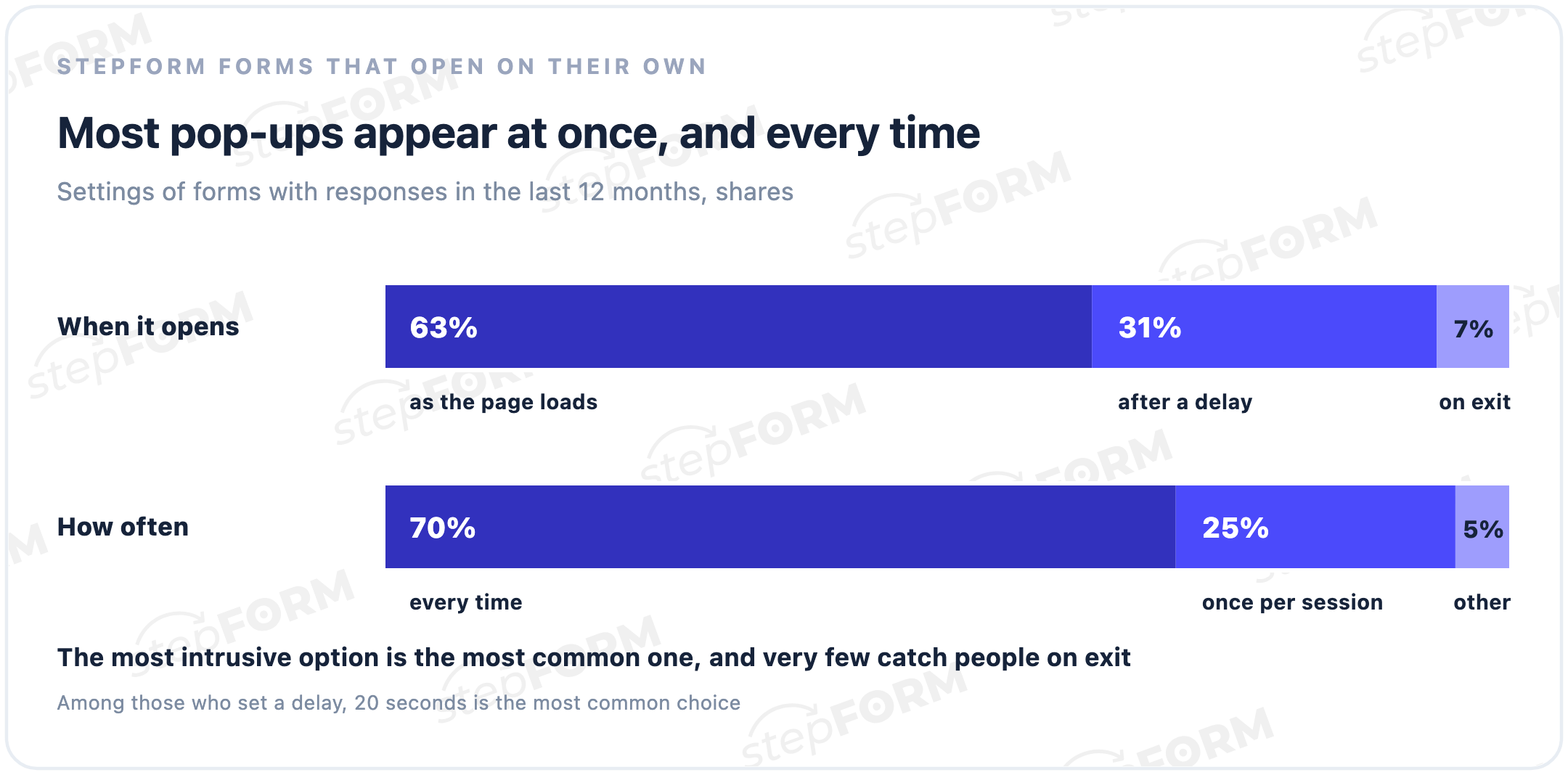
Among pop-ups with a delay, 20 seconds is the most common setting. For a long page it is a sensible starting point: people have time to read the opening and decide whether your offer is for them. A five second delay is barely different from opening at once. Check the average time on page in your analytics too: if it is shorter than the delay, hardly anyone will see the window.
The exit pop-up is the least popular choice, even though it is the most polite one: it interrupts nobody's reading and appears when the page has already failed to keep the visitor. For shops and services where people compare options for a while, it is the first one to try.
A button pop-up comes in two versions. You can place a stepFORM button on the left or right side of the screen and write your own text on it. Or you can open the window from a button of your own, such as "Request a call" in the header or "Get a quote" next to a price.
How often to show a pop-up
The second setting decides how many times one person sees the window. It can appear every time, once per session or less often, for example once a day or once a month. 70% of auto pop-ups on stepFORM are set to every time, and for most websites that is too much.
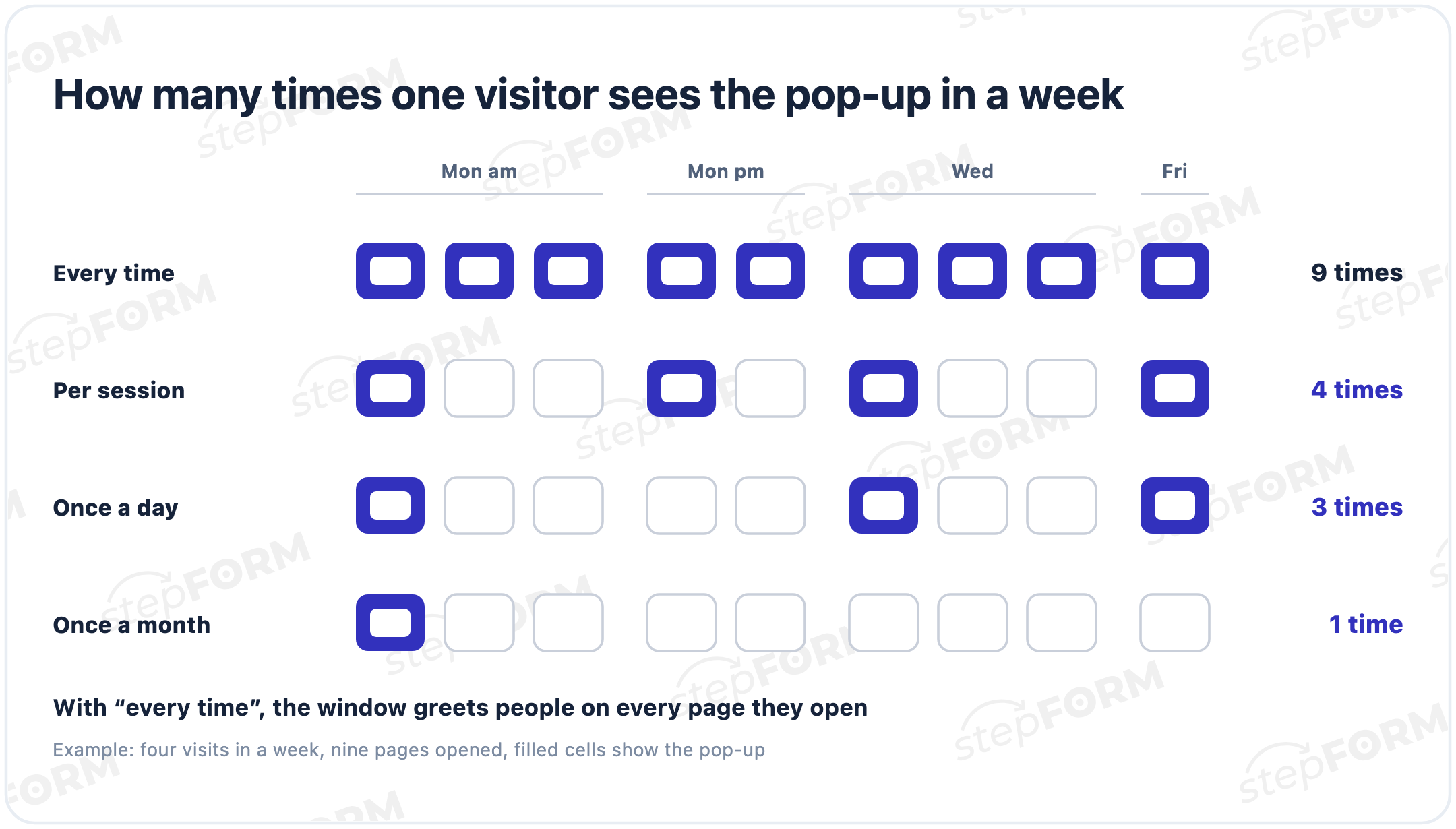
If someone opens five pages during a visit, a pop-up set to every time greets them five times. Once per session means once per visit, which is enough for the offer to be noticed. Once a day suits an exit pop-up: people see it, but do not run into it every time they come back.
What to offer in a pop-up
People close a window when they see nothing in it for them. The offer depends on what the website sells:
- Online shop. A discount or free delivery on the first order, in an exit pop-up.
- Services with a visit or a survey. A callback from a button, and a price estimate after a delay on the pricing page.
- Online school. A trial lesson or a short level test that ends with a study plan.
- Complex B2B services. A set of case studies or a checklist on blog pages. It is too early to ask for a call, while an email is an easier ask in exchange for something useful.
- Events. Registration from a "Book your seat" button, with the date and venue in the window's headline.
An exit pop-up does not have to sell anything. One question, "What stopped you from ordering?", with options like "too expensive", "could not find what I need" and "just browsing", tells you what to fix on the site. You build it in the same form builder, just without a contact field.
What to ask in a pop-up form
People take in a pop-up at a glance, so it needs one offer and one field. 91% of auto pop-ups on stepFORM ask for a phone number or email, which is fine: getting a contact is the whole point. The trouble is elsewhere. Half of these windows have 10 fields or more, and only one in ten has three or fewer. A window the person did not open themselves should stay short: a contact and one detail, and the rest can wait for the conversation.
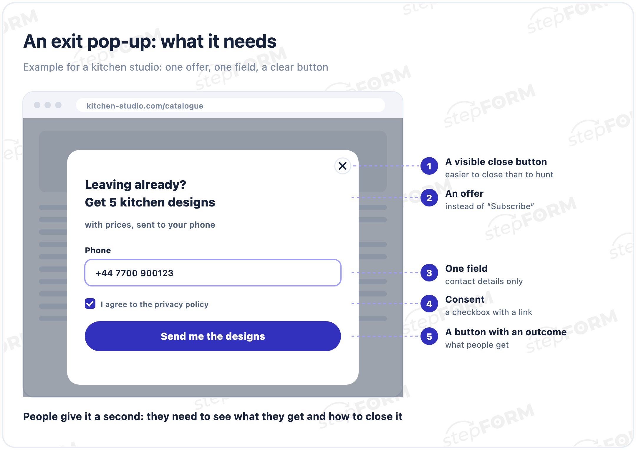
- An offer. "Get 5 kitchen designs with prices", "10% off your first order", "We will call you back in 15 minutes". The word "Subscribe" on its own promises nothing.
- One field. A phone number or an email, depending on how you will reply. Turn on an input mask for phone numbers so they arrive in one format.
- Consent. A checkbox with a link to your privacy policy, which you turn on in the submit button settings. We covered the other fields and copy a form needs in our guide to contact forms.
- A button with an outcome. "Send me the designs", "Claim my discount", "Call me back".
- A visible close button. If the window is hard to close, people close the whole tab instead.
Examples for different jobs:
| Job | When to open | Headline | Fields | Button |
|---|---|---|---|---|
| First order discount | When the tab is closing | 10% off your first order | Get the code | |
| Callback | On a button click | We will call you back in 15 minutes | Phone | Call me back |
| Price estimate | After 30 seconds on the pricing page | Get your price in a minute | Three questions and a phone | See my price |
| Shortlist | When the tab is closing | Get 5 designs with prices | Phone | Send me the designs |
| Consultation | On a button click | A free 20-minute consultation | Phone, preferred date | Book now |
A quiz in a pop-up makes sense when the person opened it themselves, from a "Get a quote" button. Our guide to quiz landing pages shows how to build one.
How to add a contact form to your websitePop-ups on phones
On a phone, a pop-up covers almost the whole screen and hides the page underneath. In its guidance for site owners, Google calls such windows intrusive: they frustrate people, make the content harder for search engines to understand and may lead to poor search performance. Instead of full-screen windows, Google recommends banners that take up a small part of the screen.
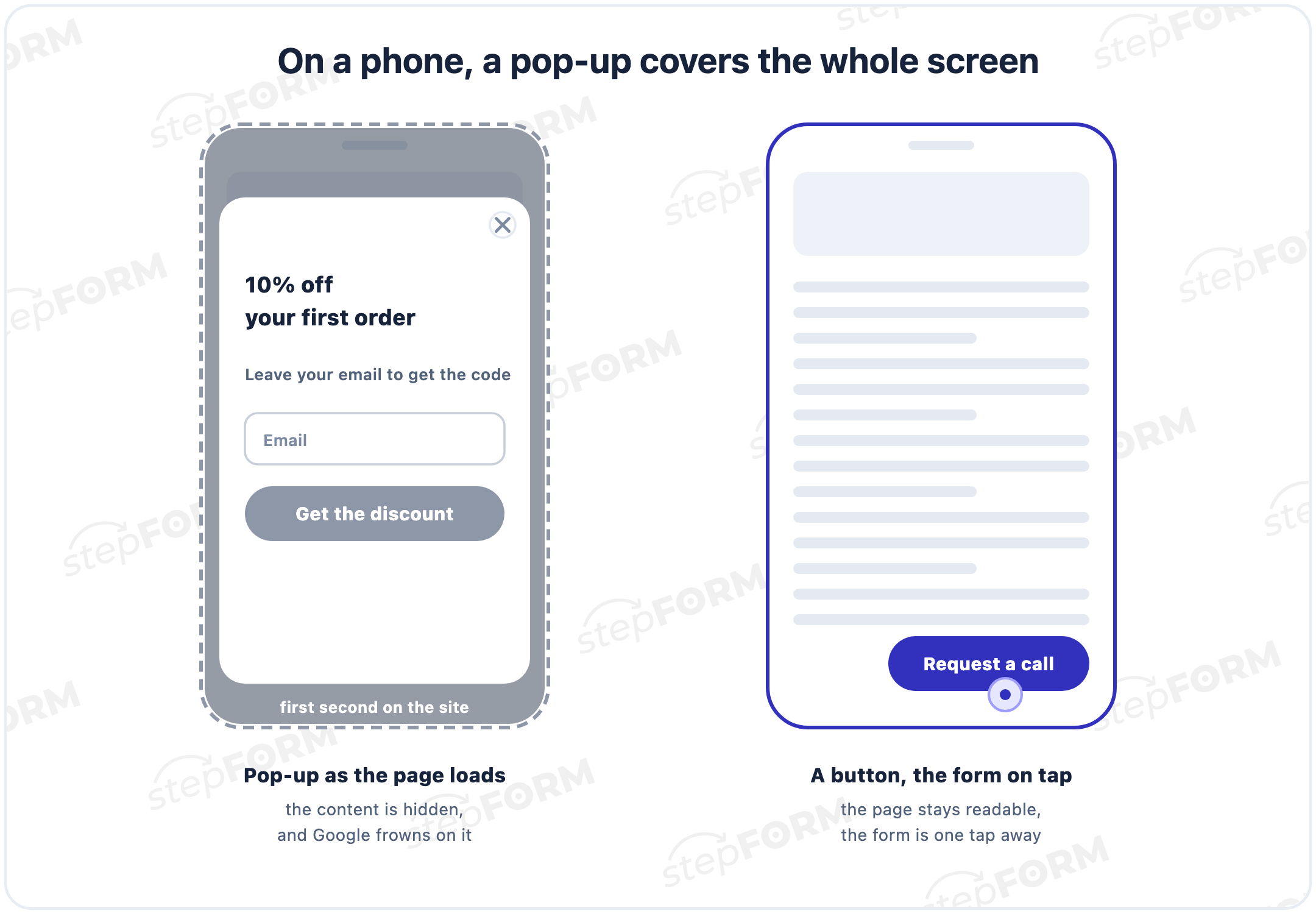
For mobile visitors a button works better: "Request a call" or "Get a quote" in a visible spot opens the form when tapped. If the window has to open on its own, give it a delay. Legally required dialogs, such as cookie consent or age verification, are not covered by this guidance.
Before launch, open the site on a phone and check four things:
- The window fits on the screen without scrolling
- The close button is visible at once and easy to hit with a finger
- The phone field opens the number keypad and accepts a number without errors
- The submit button does not slide off the edge of the screen
How to add a pop-up form in stepFORM
- Build the form in the builder, from scratch or from a template. A pop-up needs a headline, one or two fields and a button.
- Open the Share tab (some help pages call it Publication) and choose the POPUP method.
- Decide how the window opens: on its own, at once or after a delay, when the tab is closing, or on a button click. For an exit pop-up, turn on "When closing the tab" under Display options.
- Set how often the window reappears for the same person.
- Copy the code and paste it into your site before the closing body tag. If the window should work across the whole site, the code goes into the shared footer.
- Send yourself a test response from a phone and from a computer.
On Tilda, the code goes into an "HTML code" block from the "Other" section, and it is easiest to place it at the very bottom of the page, as described in the Tilda guide. On WordPress, add the code to the theme footer before the closing body tag or use a plugin for inserting code.
Responses from a pop-up arrive the same way as from any other form: by email on every plan, and in Telegram on Pro. As for what to show people after they submit, our guide to thank-you pages has examples.
How to tell whether the pop-up works
Count pop-up responses separately from your other forms. Connect Google Analytics in the form settings and set up a goal for submissions, so your reports show how many people left their details through the pop-up. The analytics integration comes with the Beginner plan.
Two weeks after launch, compare the total number of leads from the site before and after the window went live. Watch the bounce rate as well: if it climbs noticeably, the window probably opens too early or too often.
If there are few leads, change one thing at a time: first the moment it opens, then the offer, then the frequency. Change everything at once and you will not know what worked.
Common mistakes
- Opening as the page loads. People have not worked out where they are yet, and you are already asking for their email.
- Showing it every time. Close the window on one page, meet it again on the next.
- A long form in a window nobody asked for. Ten fields suit a quiz opened from a button, but they are too much for a window that opened on its own.
- "Subscribe to our newsletter" with no promise. It is unclear what people will get and how often you will write.
- A tiny or hidden close button. A window that does not close on the first try annoys people more than any offer can make up for.
- Two pop-ups in a row. A delayed window and an exit window on the same page: someone who has closed the first one gets the second. One pop-up per page is enough.
- The same window on every page. A price estimate fits the pricing page, a shortlist or checklist fits the blog. The same discount everywhere soon becomes background noise.
- On a phone, a full-screen window from the first second. The page is hidden, and Google does not like such windows.
- No goal in analytics. The pop-up runs for months, and nobody knows whether it works.
Frequently asked questions
How do I add a pop-up form to my website?
Build the form in a form builder, open the Share tab, choose the POPUP method and set when and how often the window opens. Then copy the code and paste it into your site before the closing body tag. You do not need a developer for this.
What is a pop-up form?
A form that opens in a window on top of the page, as the page loads, after a delay, when someone tries to leave or when they click a button. It is also called a modal form or an overlay.
When is the best time to show a pop-up?
When someone tries to leave the site, or after a delay once they have read the start of the page. For callbacks a button works better. Opening as the page loads gets in the way of reading, especially on a phone.
How do I make an exit-intent pop-up?
In the Share tab, choose the POPUP method and turn on "When closing the tab" under Display options. Then paste the code into your site before the closing body tag.
How often should a pop-up appear?
For most websites once per session is enough. An exit pop-up can appear even less often, for example once a day. With every time, people meet the window on every page they open.
How do I add a pop-up form to Tilda?
Copy the pop-up code from the Share tab of your stepFORM form, add an "HTML code" block from the "Other" section to your Tilda page, paste the code and publish the site.
Do pop-ups hurt SEO?
Google warns that intrusive windows covering the page content may lead to poor search performance. Opening the window from a button or after a delay is the safer choice. Legally required dialogs, such as cookie consent, are not affected.
Can I make a pop-up form for free?
You can try the stepFORM pop-up builder for free: the Free plan includes 5 forms and 50 responses a month, with email notifications for new responses. Telegram notifications come with the Pro plan.