Call to action examples for websites, ads and forms
Write clearer CTAs with 24 practical examples for websites, ads, lead forms and emails. Match the wording to the next step and test more than clicks.
Guides  Daria Lisovenko
5 October 2026
Reading time ≈ 19 min.
Daria Lisovenko
5 October 2026
Reading time ≈ 19 min.
A call to action, or CTA, asks someone to take a specific next step: view pricing, compare options, book a consultation or send a request. It can appear on a button, in an ad, in an email or at the end of a post. Useful CTA copy tells people what will happen next and matches what you can actually provide.
You click “Get a price” and land on a phone-number form, waiting for a salesperson even though nothing before the click explained that a specialist would provide the price after a conversation. Nothing is technically broken. But the label is easy to read as an on-screen estimate. If the response process is explained upfront, requesting contact details is honest. Start with the connection between your offer, the CTA and the next screen. Button colors and the word “my” can wait.
A CTA and an offer do different jobs
Your offer answers “Why would I want this?” The CTA answers “What do I do now?” “Find a security camera setup for your building” describes a useful outcome. “Find my setup” invites someone to start. Without an explanation nearby, the button has to carry the whole sales pitch.
On a website, a CTA might be a link that opens a calculator or the submit button inside a form. Those are different actions. In advertising, it helps people understand where the click will take them. In a post, it should finish the conversation you started: get the resource, answer a relevant question or explore a suitable service.
“Buy now” can fit a product page with a price, but below an article about choosing expensive equipment it may ask for too much before the reader understands the configuration, installation conditions and likely cost for their project. The button is getting ahead of the decision.
Some labels are simply there to operate an interface: “Continue,” “Save,” “Back.” They do not need a marketing makeover. If a button moves to the next question, “Get your result” is premature. There is no result yet.
Choose the CTA for the decision someone is making
Look at the question that brings a person to the page. Someone searching for advice on a home alarm is still exploring. Someone searching for a specific model with installation may already be choosing a supplier. You can sell the same service through different entry points.
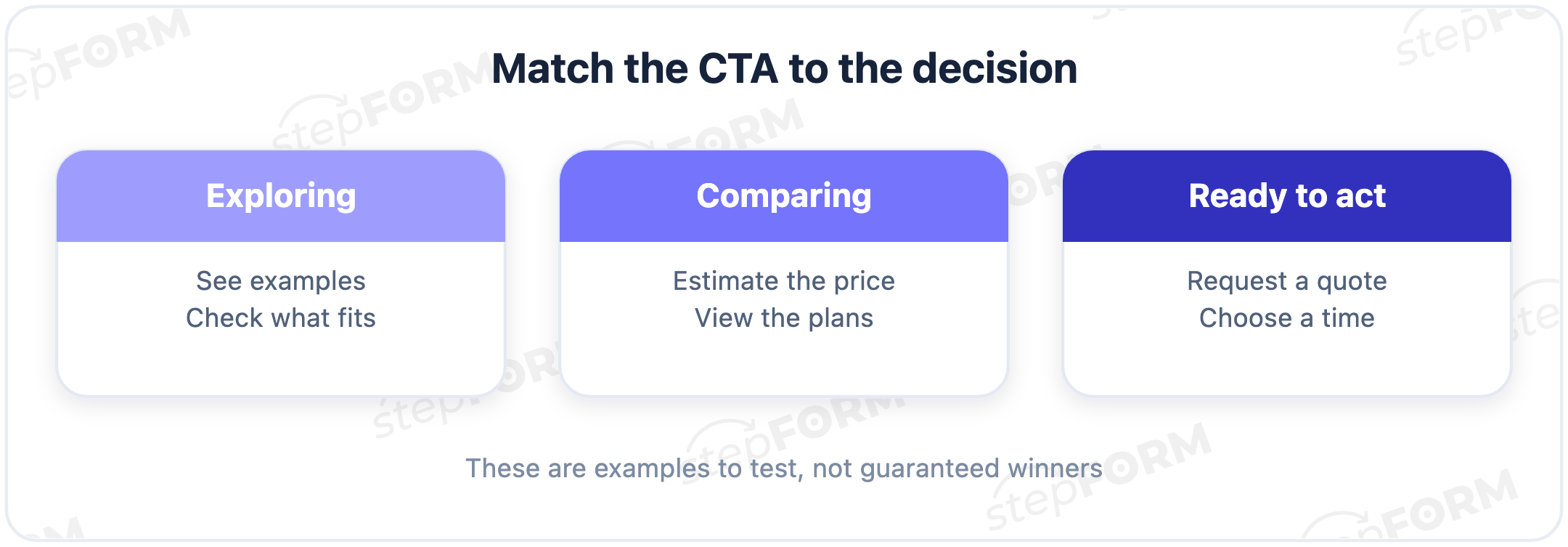
For an initial introduction, consider a step that does not require a sales conversation: “See examples,” “Find an option” or “Check whether this fits.” A comparison page can offer pricing, a calculator or terms. When someone is ready to discuss an order, a quote request, a consultation time or checkout may fit.
Treat that as a working hypothesis. An emergency repair customer may want to call on their first visit, while a returning customer may only want the instructions they need, with no intention of buying anything from the business or requesting a quote. That does not mean every new visitor needs a free download. Check the search query, traffic source and page content. The “new user” label does not explain intent.
Before writing the button, finish this sentence: “After clicking, the visitor can…” If the answer is “give us their details so someone can contact them eventually,” make the value and response process clearer. If it is “see a price based on their requirements,” show that calculation at the destination.
How a website turns a visit into a leadWebsite and landing page CTA examples
All examples below are illustrative. The revised versions are more specific within the stated scenario, not proven conversion winners. Do not copy a promise your process cannot support.
| Scenario | Vague wording | More specific wording |
|---|---|---|
| A service with defined rates | Learn more | Estimate the cost |
| Several service packages | Get started | View packages |
| Equipment selection | Contact us | Find a suitable setup |
| A custom project | Get a price | Request a quote |
| A consultation with a calendar | Let's talk | Choose a consultation time |
| Trying a software product | Join us | Try the builder |
“Estimate the cost” fits a destination with input fields and an on-screen amount. If the estimate is preliminary, say so near the button and explain what is excluded. A website calculation does not have to be a final quote. The visitor does need to understand its limits before deciding to pay.
Packages should open with their contents and conditions. Putting a phone-number form behind “View packages” adds a barrier to the promised information. You can offer a contact form further down for people who cannot find a suitable package. By then, the original promise has been delivered.
Equipment selection needs more care. In an illustrative security company scenario, a visitor chooses the property type, coverage areas and required functions, while the copy beside the CTA explains what those answers lead to: a recommended setup, an estimate or a request for specialist advice. “Find a suitable setup” does not promise an immediate answer by itself.
A custom project follows a different process. Preparing a quote may require a brief, files and a conversation. “Request a quote” allows for that wait. “Get an instant price” promises immediate delivery. You can state a response time and channel in the supporting copy, but agree on them with the team first.
Calendars have a similar distinction. Is the visitor choosing a confirmed available appointment or submitting a preferred time? If a team member still has to check the schedule and agree on the appointment, “Request a consultation” is more accurate than “Book a consultation,” even if the calendar looks like a finished booking service. It is still a request.
For a product trial, explain the conditions nearby: whether an account is required, what becomes available and whether payment details are needed. “No sign-up” and “No card required” are promises to verify, not phrases to borrow from another company's page. More energetic copy will not repair a false promise.
Ad CTAs should keep their promise after the click
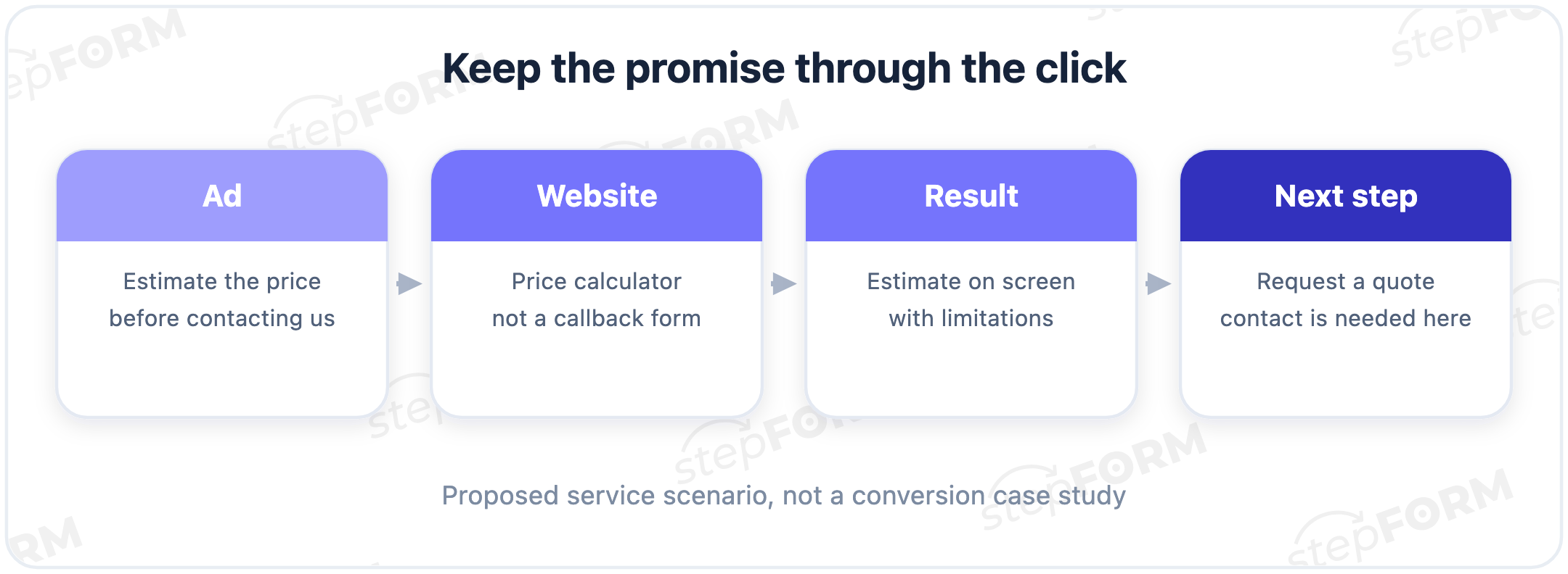
The ad and its destination should describe the same outcome. Google Ads recommends matching the ad's call to action to the landing page. Our practical recommendation is to inspect the journey as a visitor, including the first screen and the action it offers.
| Advertised offer | Vague wording | More specific wording |
|---|---|---|
| Service availability by address | Click here | Check your address |
| A product range | Don't miss out | Browse models in stock |
| Advice on a specific project | Discover everything | Discuss your project |
| A course with a free introductory lesson | Join in | Watch the introductory lesson |
| A business proposal | Start saving | Request a proposal |
| A product demonstration | Explore the possibilities | Watch a demo |
An ad about in-stock models should lead to those models without a search through a general catalog of made-to-order items, and an invitation to watch an introductory lesson should provide that lesson under conditions explained before the click. A homepage is easier to maintain. That is a weak reason to send every ad there.
An address check should produce an availability answer or a clearly described request for a manual check. If a specialist must respond, explain that before the visitor sends the address. A free lesson must remain free under the promised conditions. Explain any registration required before watching it too.
“Watch a demo” implies a recording. If the next step is arranging a meeting with a salesperson, “Book a demo” or “Request a demo” may be more accurate, depending on whether the meeting is confirmed. Watching a video and scheduling a call require different commitments.
Ad platforms may restrict the button labels. For example, Google Ads lead form assets use a predefined CTA list. Choose the closest available action and explain the offer in the headline and description. These examples do not mean you can install any custom label on every advertising platform.
A real registration deadline, limited stock or genuine promotion terms can give someone a reason to act, but a timer that resets for every visitor invents a deadline and pressures them to hurry for an offer that will still be there tomorrow. I would remove it. Pressure does not make the offer clearer.
What to write on a form button
At the final form button, someone is giving you their information. Name the action they are agreeing to and explain what follows nearby. “Get your gift” does not replace participation terms. “See pricing” does not explain why a salesperson will call.
| Form | Unclear label | More specific wording |
|---|---|---|
| A question about a service | Submit | Send my question |
| A callback request | Done | Request a callback |
| A quote request with project details | Continue | Send quote request |
| Event registration | Next | Register |
| An intermediate quiz step | Get my result | Next question |
| An order before payment | Place order | Continue to payment |
The last two rows are easy to get wrong. The next question does not provide a result yet. Moving to payment does not confirm a successful purchase. The final payment action needs its own clear label, with the amount and order in context. Do not hide a financial action behind an innocent “Continue.”
For a callback, explain who will call and when. If you cannot commit to a response time, do not promise a call within a minute. For a quote, describe what the team will prepare and how it will reach the visitor. The explanation can sit beside the form, leaving the button short.
The fields should fit the action. An email reply requires an email address, while a phone number needs a separate explanation, especially if everything before the form invites people to view an estimate quietly and says nothing about a sales conversation. Why ask for a number to view a result? Hiding that switch undermines the invitation.
Review privacy and data-processing requirements separately. Replacing “Submit” with a clearer phrase does not resolve those questions or turn a button into a universal legal agreement. Our contact form guide covers field selection and setup in more detail.
Choose fields and set up a contact formCTAs for posts, emails and messages
A post can end with a shopping list of requests: buy, subscribe, share and comment. Choose the action that follows from this particular piece. An email's main link should continue the email's topic instead of sending readers to an unrelated section of the site.
| Context | Generic invitation | A specific next step |
|---|---|---|
| A post explaining a task | Let us know what you think | Which step takes you the longest? |
| An email offering a template | Get the value | Download the project brief template |
| An email series announcement | Be part of it | Subscribe to the project breakdowns |
| An email about service selection | Learn more | Find an option for your project |
| A consultation message | Looking forward to your reply | Reply with a time that suits you |
| A post showing completed work | Order now | Send your project details for an estimate |
Asking about the future of an entire market requires a small essay, whereas a question about one step in the reader's work gives them something concrete to answer from experience, without preparing an industry review. I would start there. It does not guarantee more comments.
“Download the project brief template” should open the file or a clearly described page for obtaining it. If an email address is required first, say so before the click. Do not call something a download when it is really a request for a conversation during which someone might offer the file later.
For a subscription to project breakdowns, explain the topics and expected frequency. This differs from receiving a single template: people should understand that they are subscribing to a series of messages. Do not conceal that subscription behind a file-download button.
A keyword reply can be useful when it triggers a configured resource delivery or helps the team identify the request. If a person must reply manually, explain that process. A fashionable keyword does not create automation or make the resource useful.
Check whether a commercial email can actually receive replies. A “Reply to us” invitation is useless if the sending address does not accept messages. On a phone, open the destination and return. Readers should not lose their email just to inspect the conditions.
Write your own CTA without hunting for magic words
Start with a result that already exists. Suppose a business prepares a preliminary quote after reading the property details. “Request a quote” is more honest than “Get an exact price.” Add the delivery process next: an email reply after reviewing the brief. Then decide which fields are required.
Copy this working template into a task for your designer or marketer:
- The visitor comes from … and wants to understand …
- We offer …; the visitor needs to provide or do …
- CTA wording: …
- After the click, the next screen is …
- After completing the action, the visitor receives …; the person responsible for delivering it is …
- Response time, limits and delivery channel: …
- We measure completion using … and result quality using …
If nobody can answer “Who delivers the promise?”, the button is not ready. Marketing can write “Get your recommendations today,” but someone has to prepare them for evening and weekend requests too, unless the copy states working hours or a different response time. Who is taking that on?
Now shorten the label to a recognizable action. Keep the supporting detail in the heading and nearby text. For example: heading, “A quote for your property”; explanation, “Describe the space and the job. A specialist will follow up by email”; button, “Request a quote.” The button does not need to become a paragraph.
Check five tempting promises separately: “free,” “instant,” “exact,” “book” and “no sign-up.” Find proof for each in your actual process. If only the initial discussion is free, specify that. If an appointment is confirmed after a call, offer an appointment request.
Show the page to someone who did not help build it. Before they click, ask what they expect to see next. Compare their answer with the actual destination. This is a small comprehension test. It can uncover ambiguity, but it does not replace measuring leads and sales.
Placement and mobile checks
Put the CTA where the visitor has enough information to make that decision. For a simple service, that might be the opening screen with the benefit and terms. For a complicated project, you can repeat a quote request after the examples and scope of work. Repeat access to the same action rather than introducing five different promises.
One primary CTA does not mean removing normal navigation, contact details or supporting links. Choose the main commercial action and give it visual priority. A quieter “See an example” link can serve people who need reassurance. Three equally prominent buttons asking for different decisions remove that priority.
The GOV.UK Design System recommends labels that describe the action and warns against competing primary buttons. This is interface guidance, not evidence that a particular layout increases sales on every landing page.
On mobile, check text wrapping, spacing from other links, form opening and the route back. A sticky button must not cover a field, an error message or the final action. Using the page on a phone tells you more than shrinking a desktop screenshot.
There is no universal highest-converting button color. If “View packages” opens a callback form, changing purple to green will not fix the mismatch, however clearly the new button stands out against the background or matches the rest of the page. Check the meaning of the transition first. Then visibility and readability.
Measure the outcome, not just the click
Choose the main metric first: a confirmed submission, a suitable lead or a payment. A CTA click helps diagnose the entry point. It does not prove that the visitor reached the outcome. A more intriguing label may simply attract additional form openings.
Write down the journey for this invitation: saw it, clicked, started the action, completed it, received the promised result. Then include the business check: how many enquiries fit the service? Measuring only sales makes it harder to see which transition changed.
Here is an illustrative calculation. Variant A gets 120 clicks and 24 submissions from 1,000 impressions. Variant B gets 160 clicks and 20 submissions from 1,000 impressions. The click rate rises from 12% to 16%, while the submission rate falls from 2.4% to 2%. Judged by clicks, B looks better. These invented numbers explain metric choice. They do not establish a statistically significant difference.
To test one word, keep the offer, fields and post-click journey the same. If you change “Contact us” to “Estimate my cost” and replace the form with a calculator, you are testing the whole experience. That can be a useful test. It cannot show that the wording alone caused the change.
Compare similar traffic. Running variants in different weeks mixes the CTA effect with audience changes, advertising and seasonality. Where possible, use random assignment, a metric chosen in advance and a stopping rule. Do not stop at the first encouraging day. The required sample and duration depend on your baseline and the effect you are trying to detect.
With little traffic, start by checking comprehension and the actual journey. Record changes as hypotheses until you have enough evidence to compare them. A few reader responses can help you edit. They do not justify a claim that conversion increased.
Keep different reasons for abandoning the journey separate. If a visitor understands the offer, clicks and leaves at the mandatory phone field, the problem may be the information request rather than the entry button; if the promised file is missing, fix its delivery. That turns a CTA review into a specific task for the team.
Agree in advance on what counts as a suitable enquiry: service, location, budget or another business criterion. Review both variants in the same way and allow for the time needed to process a submission. Otherwise you compare an untouched queue of new leads with an older queue that has already been reviewed.
Connect the CTA to a stepFORM form or calculator
stepFORM lets you build a request form, quiz or calculator and set a button action. For a marketer, that provides the destination promised on the page. The website invitation and the action inside the form are configured separately. The builder does not decide whether they match.
Consider our real teaching calculator for a custom sign. Dimensions, material and mounting determine an on-screen amount. The price is visible before the request button. An entry point can therefore offer a cost estimate, with the subsequent commercial step kept separate. The rates are fictional. This is not an offer to buy a sign.
Here is a proposed entry block for that example: heading, “Estimate the cost of your sign”; explanation, “Choose dimensions, material and mounting. The teaching estimate appears on screen”; CTA, “Estimate the cost.” After the click, visitors see the options and total. This is suggested entry copy. The screenshot shows the real calculator, not a verified quote-delivery workflow.
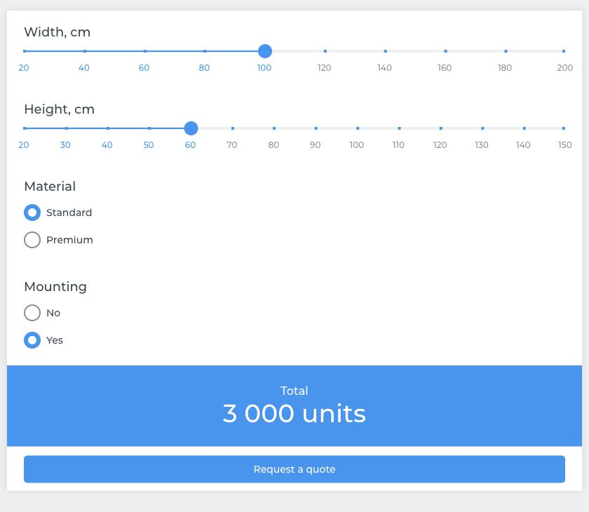
The screenshot is the English teaching version. It illustrates the separation between viewing a price and taking another step. For a working website, add the required contact field and a clear response process. This teaching screen is not a complete order-handling system. Configure and test receipt of the response separately.
The stepFORM element documentation lists button actions including submitting a form and opening a link. Recording a response requires submission. Opening a document requires a link. Renaming a button does not change its configured action.
You can configure a message after submission using the thank-you page settings. Confirm what happened and explain what follows. Do not promise an instant call or email unless that process is set up. The separate pricing article explains the underlying calculation.
The teaching price model and calculation checksChoose one CTA from your page and complete the working template above. Then build the matching form in stepFORM, with the required fields, the correct button action and a message after submission. Before running ads, test the whole journey in a separate test form, including the received response. Do not insert fictional enquiries into a production form without agreement.
Frequently asked questions
Does a CTA have to start with a verb?
No. In a pricing context, “Pricing” can be a clear link label. For a standalone action button, a verb helps name the step, such as “View pricing.” Choose according to the context and check whether people understand the element without an explanation from its author.
Is “Get my estimate” better than “Get an estimate”?
There is no universal winner. First-person wording is worth testing when the result is genuinely personal. Resolve any mismatch between the promise and the next screen first, then compare wording on similar traffic using your chosen metric.
Can AI write a call to action?
Yes, if you supply the offer, audience, next screen and limits. Treat the suggestions as drafts. Check promises about cost, timing, booking and automatic delivery. A model does not know your actual process without those details.
What CTA fits a long sales cycle?
Offer a manageable intermediate step: review a specification, discuss the requirements or request a project estimate. Explain what you will prepare afterward. Track lead quality too, since an immediate purchase may be rare in that setting.
Should every traffic source have a different CTA?
Not necessarily. Ads with the same promise can lead to the same action. Separate versions are useful when intentions differ: one audience needs a catalog, another needs a quote. Keep sources measurable separately rather than treating all clicks as one audience.