Elements and their settings
Multiple choice
Multiple choice involves selecting several options at the same time. It can be used to choose additional services, products, etc.
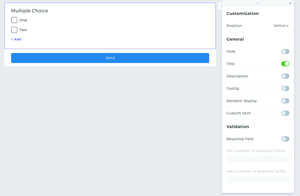
- In customization, you can set the layout of elements either vertically or horizontally.
- In general settings, you can hide the element, enable the display of the name, description, and tooltip, activate a random order of items (they get ramdomized whenever the form is opened by a new respondent), and add the option for a custom answer.
- In the validation settings, you can set whether this element is required for selection, as well as specify the minimum and maximum number of items that must be selected to submit a response from the form.
A horizontal layout is displayed in the preview mode and then in the form once it is deployed on the website or accessed via a direct link.
Radio Button
This one is most often used to choose a primary service or only one option from several items.
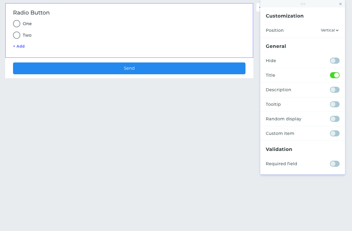
- As with the «Multiple Choice» element , there is an option to customize the layout of elements either vertically or horizontally.
- In the general settings, you can hide the element, enable the display of the name, description, and tooltip, activate a random order of items, and add the option for a custom answer.
- The validation settings allow for the configuration of the element as a required choice.
Choose Images
Choose Images allows users to select an answer option with an image. Perfectly suited for demonstrating products.
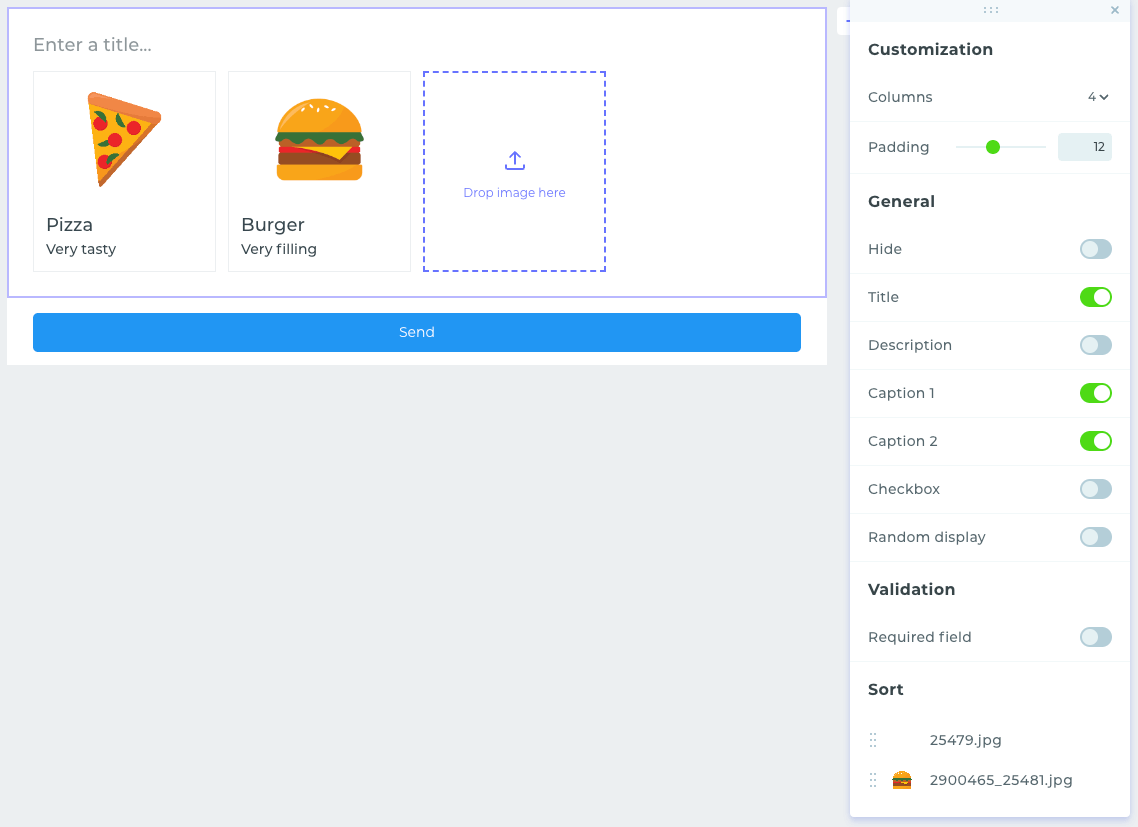
- Customization settings allow you to specify the number of displayed columns and set the exact margin between them.
- In general settings, you can hide the element, enable the display of the name, description, tooltips, and captions, provide the option for multiple selections, and activate a random order of items.
- The validation settings allow for the configuration of the element as a required choice.
Dropdown List
Dropdown List is designed for selecting one item from many. Unlike single choice, it allows hiding many elements, making it more compact.
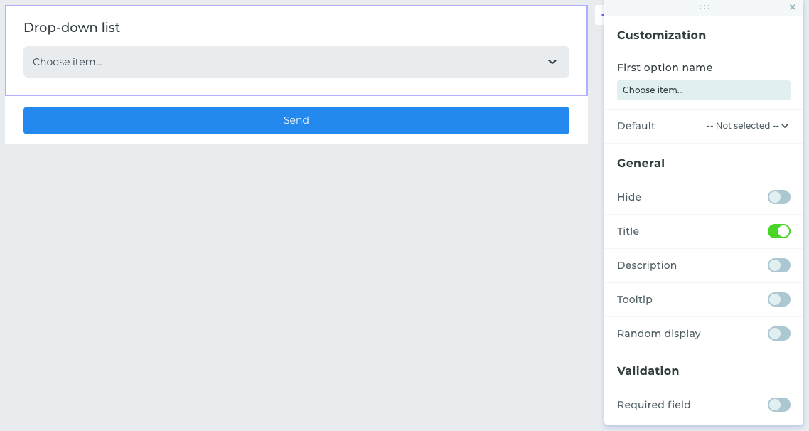
- Customization settings allow you to change the hint text in the first item and set a default selected item.
- In general settings, you can hide the element, enable the display of the name, description, and tooltip, and activate a random order of items.
- The validation settings allow for the configuration of the element as a required choice.
Range
Range allows the user to select a number using a slider within a specified range.
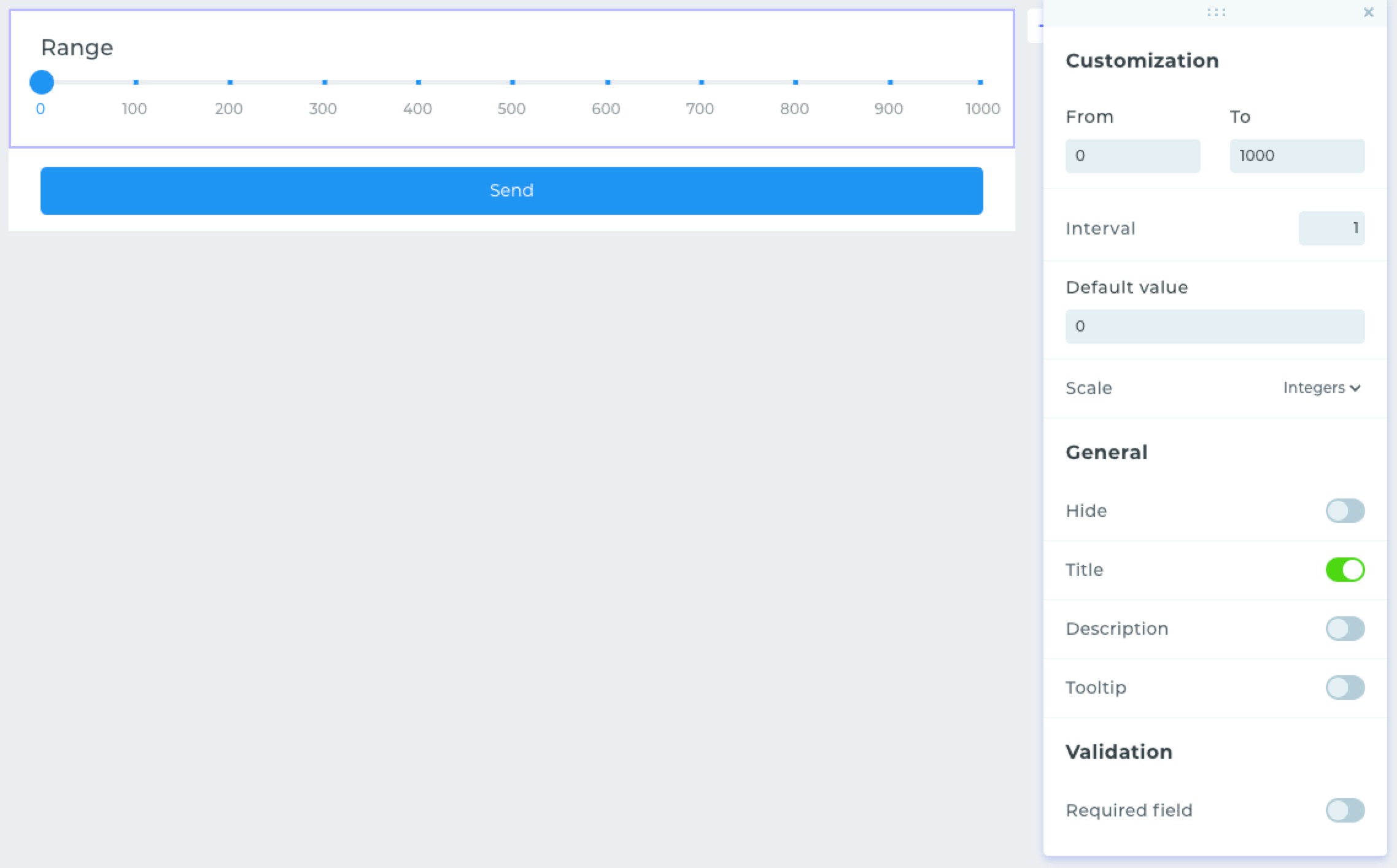
- Customization settings provide the ability to set range start and end values, with the option to set a custom step. You can also set a default value and customize the display of numbers on the scale. These can be all whole numbers, extreme numbers, or you may even choose to hide all the digits on the scale.
- In general settings, you can hide the element, enable the display of the title, description, and tooltip.
- In validation, there is an option to require a mandatory response in the element.
Cart
This widget allows the creation of mini stores by collecting various configurations inside a form with subsequent sending of notifications by email, in Telegram, or to a CRM system. This widget is different from all the others and has its own settings.
Cart Settings
To go to the widget settings, you need to click on the «Cart» icon.
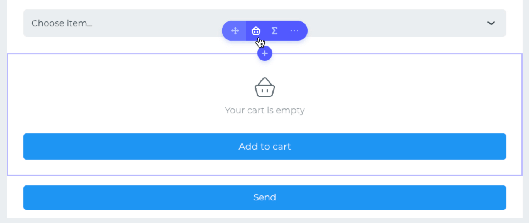
In the window that opens, all possible settings will be presented.
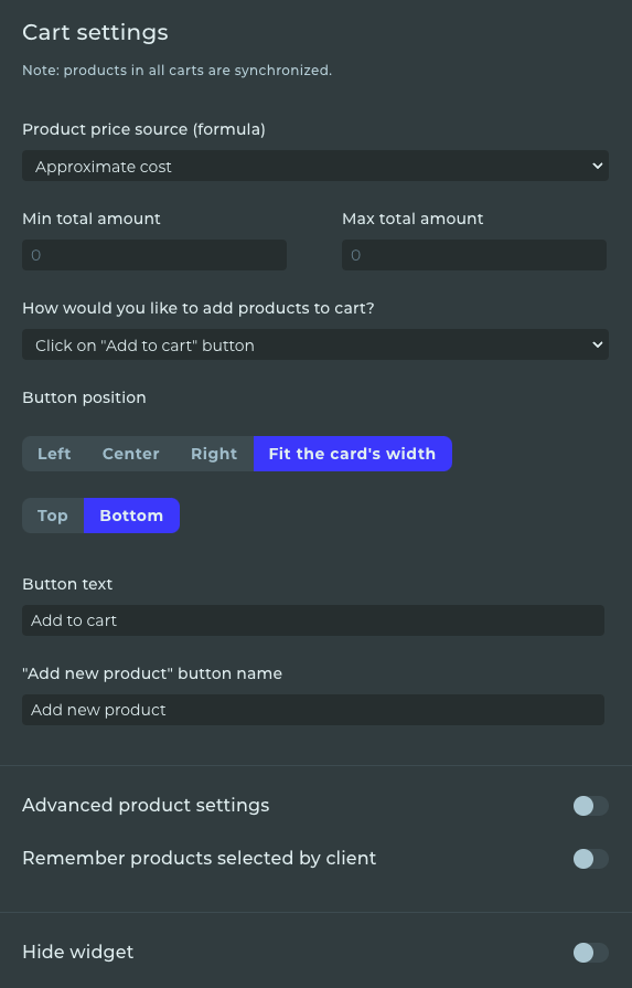
Let's take a closer look at each setting.
Source of product cost:
- You need to choose the formula from which the product cost will be used when adding to the basket. Most often, it is the final formula based on the calculations of all fields.
Minimum and maximum cart amount:
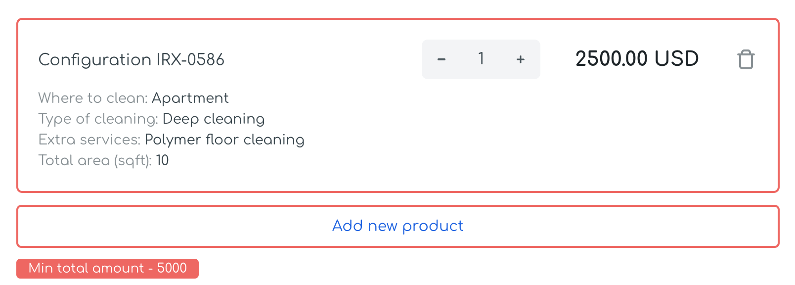
- allows you to set a limit and upon reaching the minimum order amount in the cart, it will be possible to submit the order form. If the conditions are not met, a warning message will be displayed.
Method of adding a product to the cart:
- you can set the method of adding a product to the cart by clicking a button or without adding (just showing). The second method will be useful if you have several pages with carts set up in your form, and on the last page, the widget will simply display a list of all products with the possibility to increase their quantity.
Button position:
- allows you to adjust the placement of the «Add to cart» button.
Text on the button and before and after adding a product:
- in these fields, you can customize the standard texts of buttons for cases when a product is added to the cart for the first time and for subsequent additions.
Advanced product settings:
- when activating advanced product settings, it is possible to change the name of the product position. In the field, you can specify your custom text and choose available values, which will use data based on the form completion.
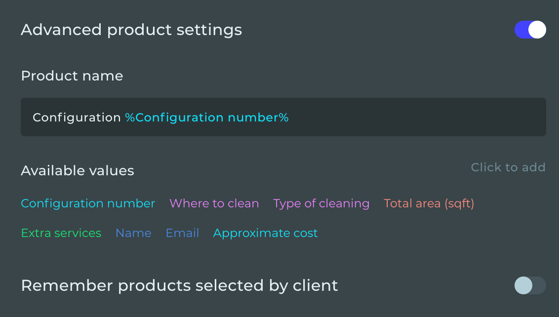
Remember products selected by the customer:
- if this parameter is activated, then the added products will be saved in the cart after leaving and reopening the form later.
Hide widget:
- You can hide the widget and use this in further logical conditions. For example, display the cart after filling out a certain field.
Formula
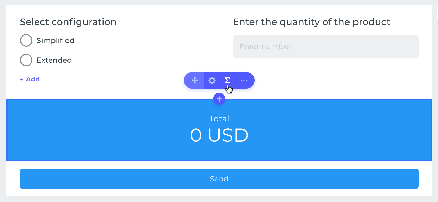
Formula is designed for creating calculations based on selected parameters in the form. When navigating to the formula management menu, you can adjust the value of fields, as well as change the formula itself for calculation. To go to settings, click on the «Amount» icon.
Field Values and Formula
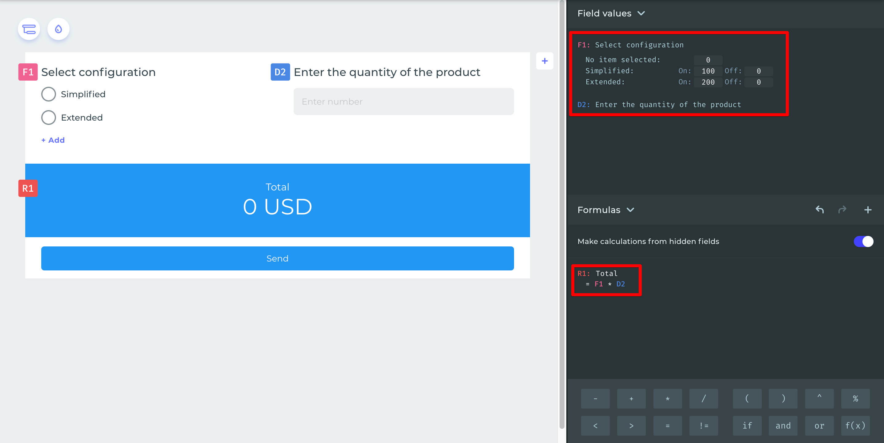
Let's delve into the field values and the formula. You can set your own value for the item's fields depending on the user's choice.
In the presented example, the value of F1 is based on the selected configuration. If the «Simplified» option is selected, then the value 100 will be used in the F1 variable in the formula, and 0 when it is not selected. When the «Extended» option is chosen, the variable's value will be 200, and 0 when it is nit chosen. The value of D2 is formed based on the number entered by the user, and the formula calculation will be performed by multiplying F1 by D2.
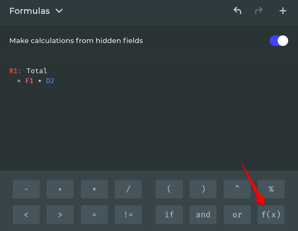
In addition to logical expressions and mathematical operations, it is possible to use advanced mathematical functions in formulas, such as log(). To do this, click the button with the function.
Available mathematical functions: abs, acos, acosh, asin, asinh, atan, atanh, cbrt, ceil, cos, cosh, exp, floor, log, round, sin, sinh, sqrt, tan, tanh, trunc.
Additionally, you can disable the calculation of hidden fields. This is useful in cases where the final formula uses variables that are hidden through logical branching and should not participate in the calculation.

- Customization settings offer text alignment and value format changes with options for setting prefixes, suffixes, digit grouping, fractional parts, and rounding.

- In general settings, you can hide the element and the title.
Text Input
Provides the user with the ability to enter their own text.
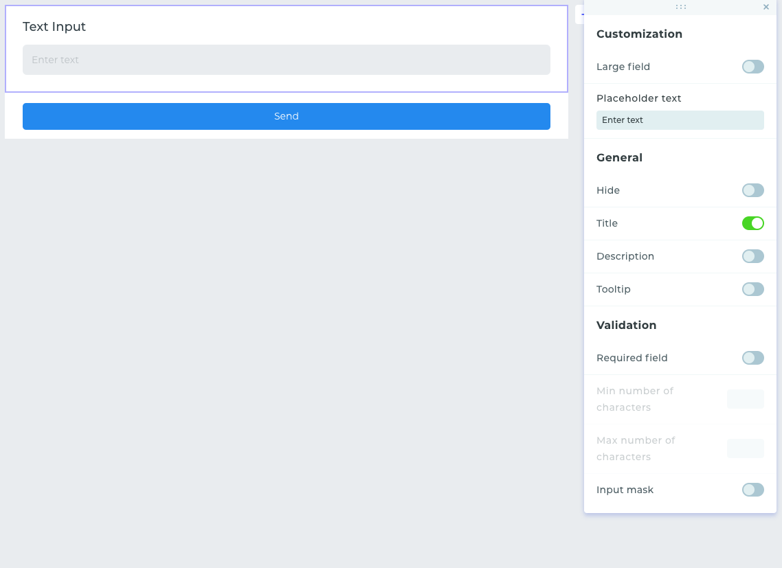
- Customization settings include the «Large Field» parameter, which allows for a large input field to be enabled if necessary. You can also set your own text in the input field's tooltip.
- In general settings, you can hide the element, enable the display of the title, description, and tooltip.
- Validation settings allow for the requirement of a response in the field, as well as setting minimum and maximum character counts.
Digital Input
Provides the user with the ability to enter their own number, which can later be used in formula calculation.
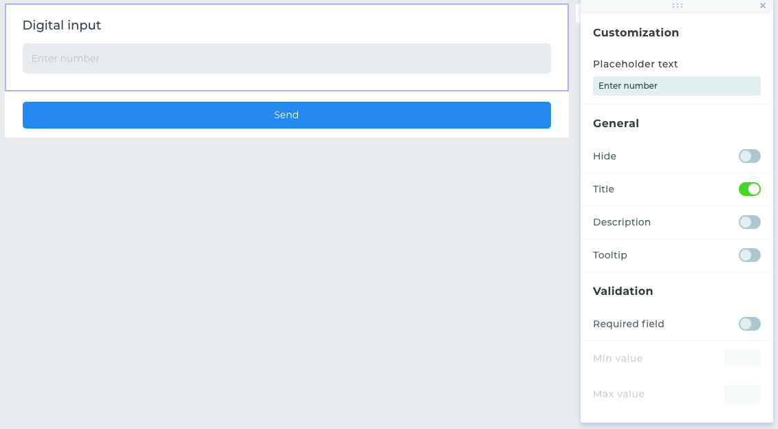
- Customization settings include the «Large Field » parameter, which allows for a large input field to be enabled if necessary. You can also set your own text in the input field's tooltip.
- In general settings, you can hide the element, enable the display of the title, description, and tooltip.
- Validation settings allow for the requirement of a response in the field, as well as setting minimum and maximum character counts.
This field is designed for entering an email address. Validation settings are already functionally defined, and entering an incorrect email is not possible.
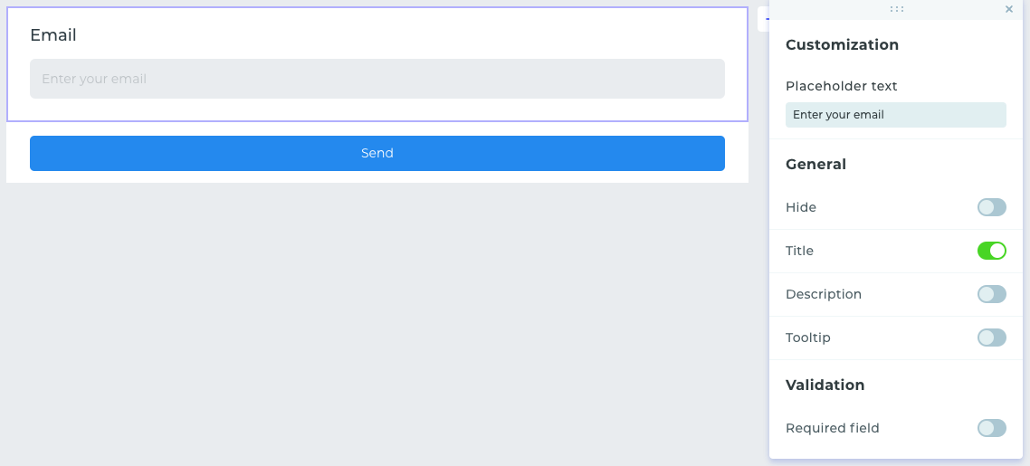
- In customization settings, you can change the text in the input field's tooltip.
- In general settings, you can hide the element, enable the display of the name, description, and tooltip.
- In validation settings, there is a setting for the mandatory input of an email address.
Mobile Phone
This field is intended for entering the phone number only. Validation occurs automatically upon entry. There is also an option to select the country phone code by clicking on the flag icon.
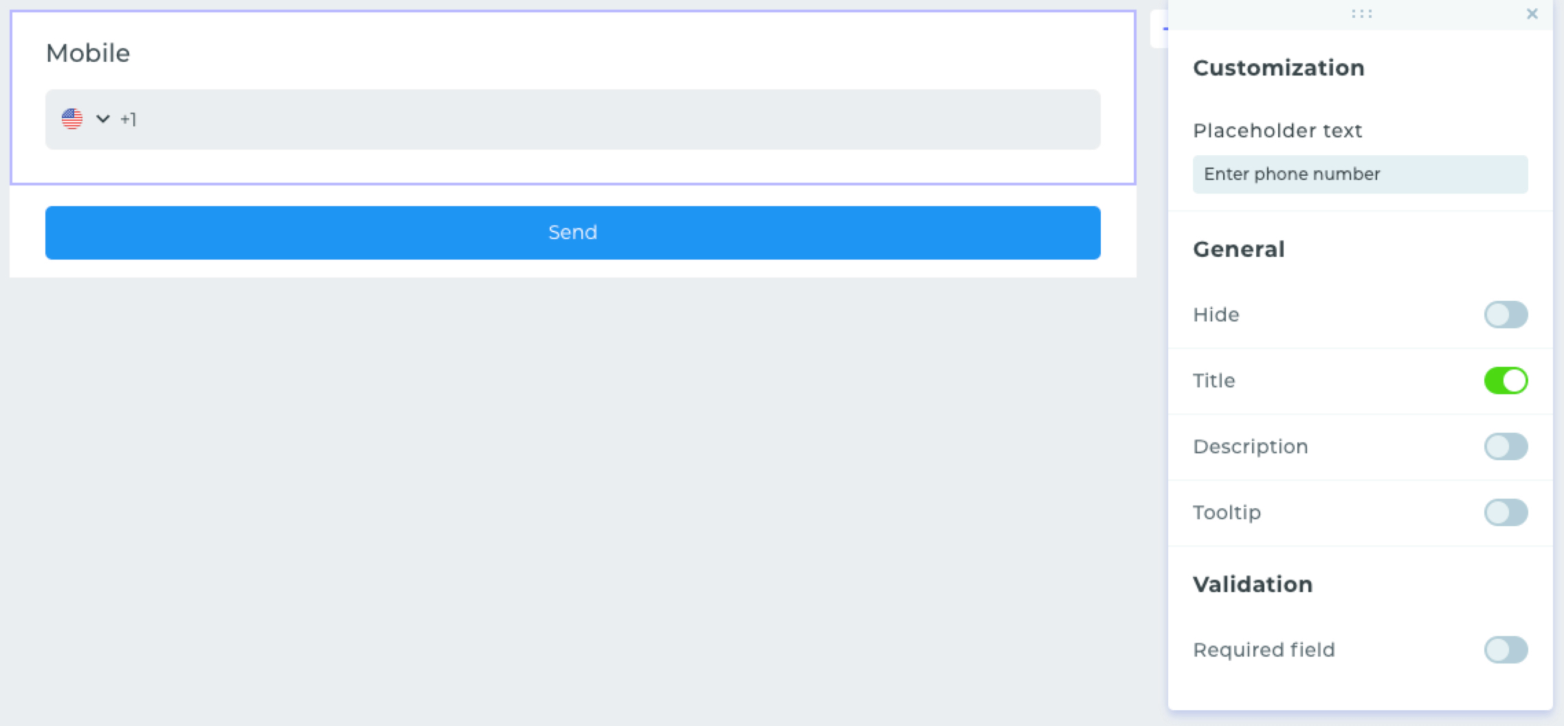
- In customization settings, you can change the text in the input field's tooltip.
- In general settings, you can hide the element, enable the display of the name, description, and tooltip.
- In validation settings, there is a setting for the mandatory input of a phone number.
Date and Time
These fields are designed for the user to select a date and time.
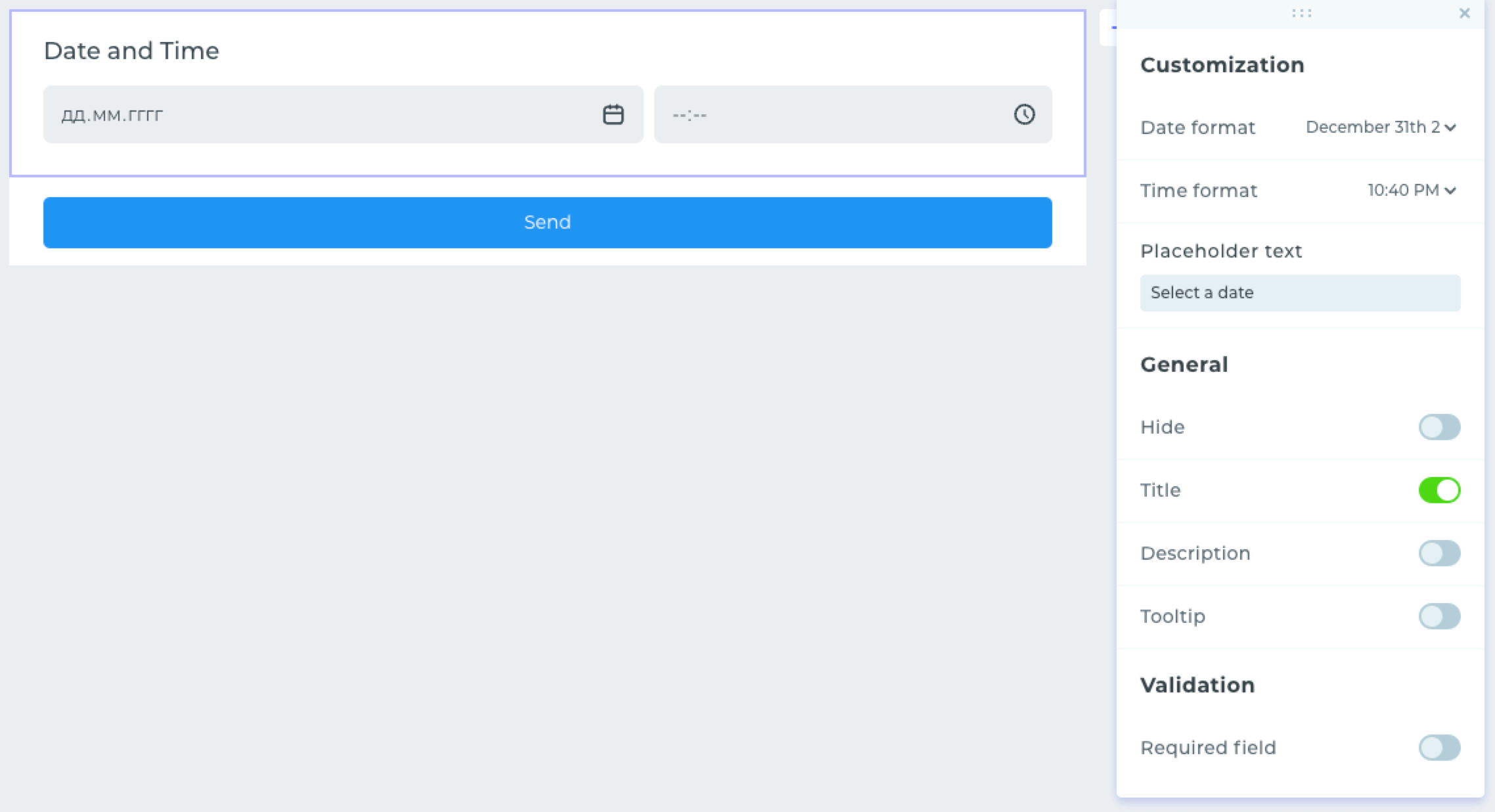
- In customization settings, you can change the date and time format, as well as the tooltip in the input field.
- In general settings, you can hide the element, enable the display of the name, description, and tooltip.
- In validation settings, there is a setting for the mandatory completion of the date and time.
File Upload
This widget provides the user with the ability to upload files of different formats. The element allows for fine-tuning of the uploaded files. You can prohibit or allow the upload of specific file formats. In the placed element, click on the «Gear» icon.
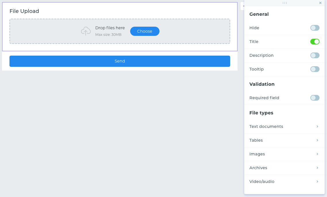
In the window that opens, in the «Format» section, all categories of files for upload will be displayed. To do this, go to a category and click on it.
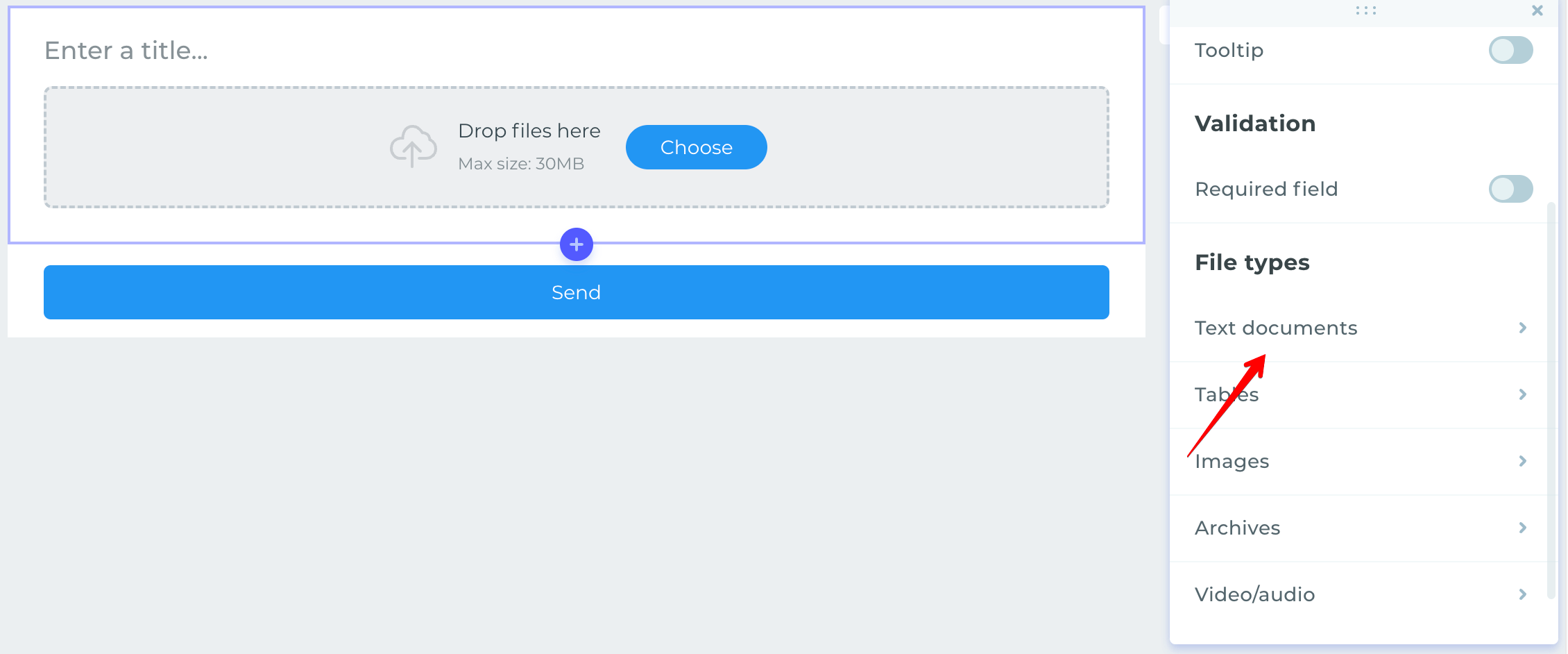
By default, all file formats are available for upload.
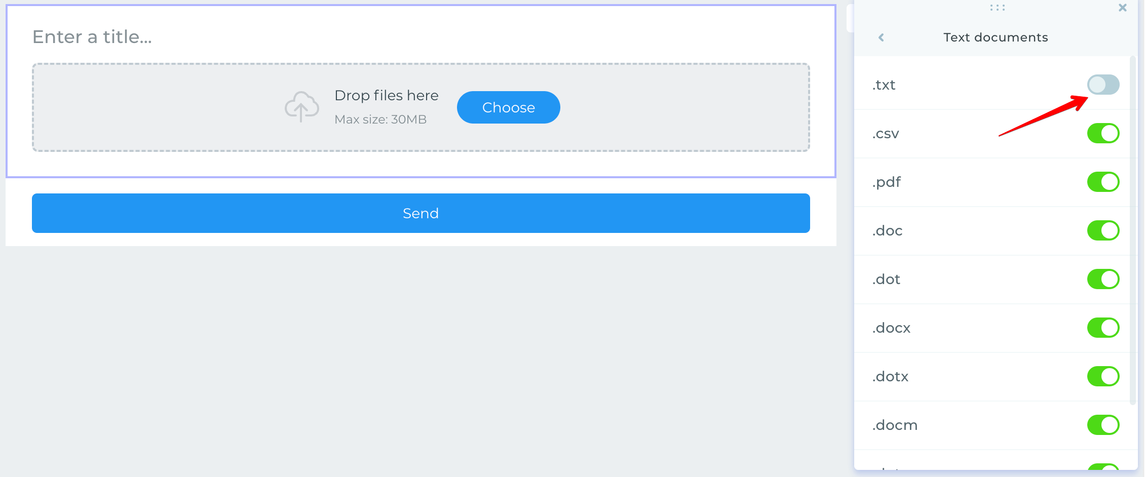
To prohibit the upload of a file format, the toggle must be switched to the inactive position.
- In general settings, you can hide the element, enable the display of the name, description, and tooltip.
Rating
This element allows collecting feedback from users in the form of a review, by choosing from three to ten stars.
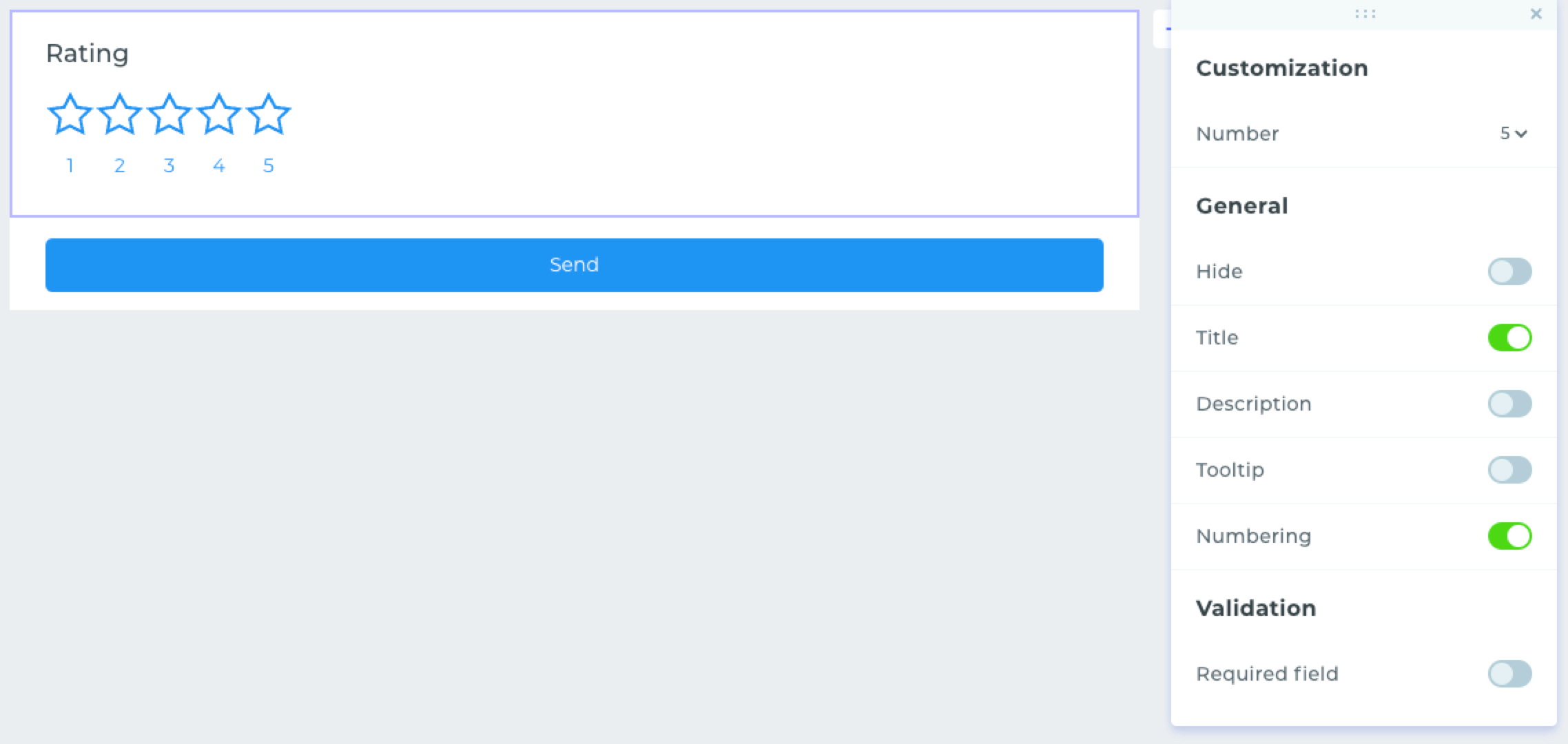
- In customization settings, it is possible to change the number of stars displayed.
- In general settings, you can hide the element, enable the display of the name, description, tooltip, and numbering.
- In validation settings, there is a setting for the required answer in the field.
Button
In addition to the default send button, you can place your own button. It is also possible to set an action upon clicking.
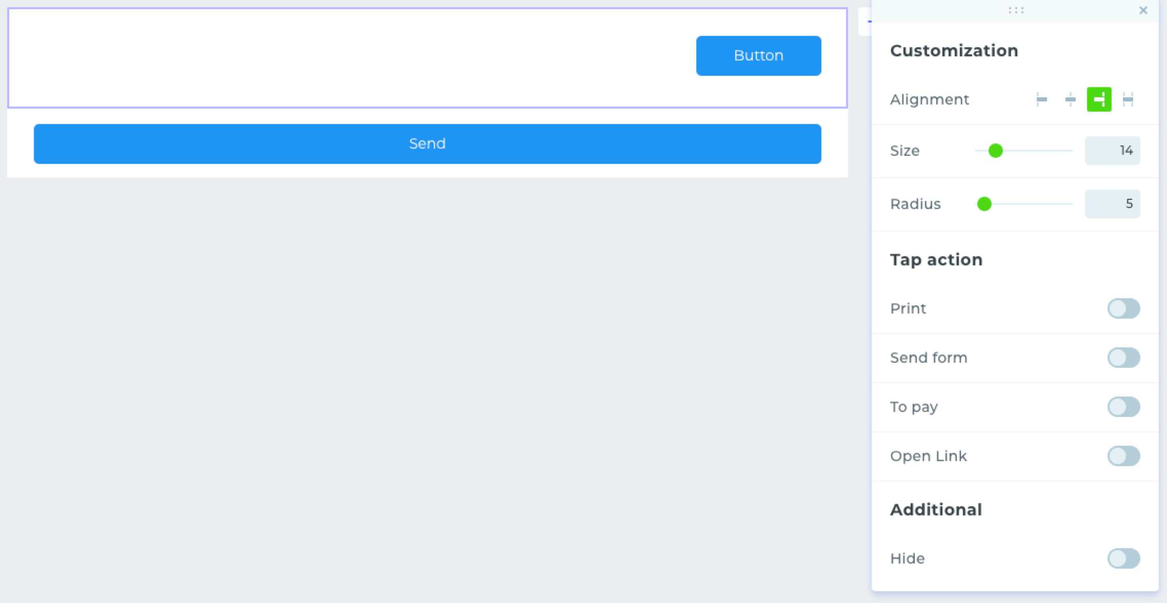
- In customization settings, it is possible to adjust alignment, size, and radius.
- The actions available upon clicking include printing the form, submitting the form, making a payment, and opening a link.
Image
In this element, you can place your own image in jpg, jpeg, png, gif, and svg formats.
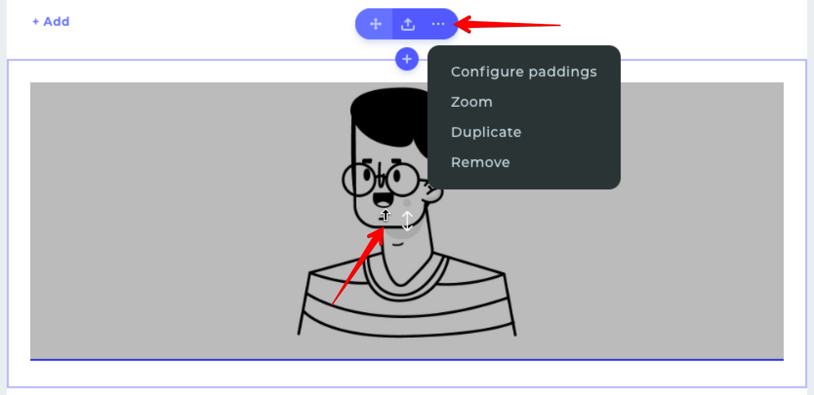
- In additional settings of the element, you can change the scale of the image, as well as change its position by dragging it up or down.
Message
In this element, you can place your own text with the possibility of customizing its styling. To do this, select the desired text.
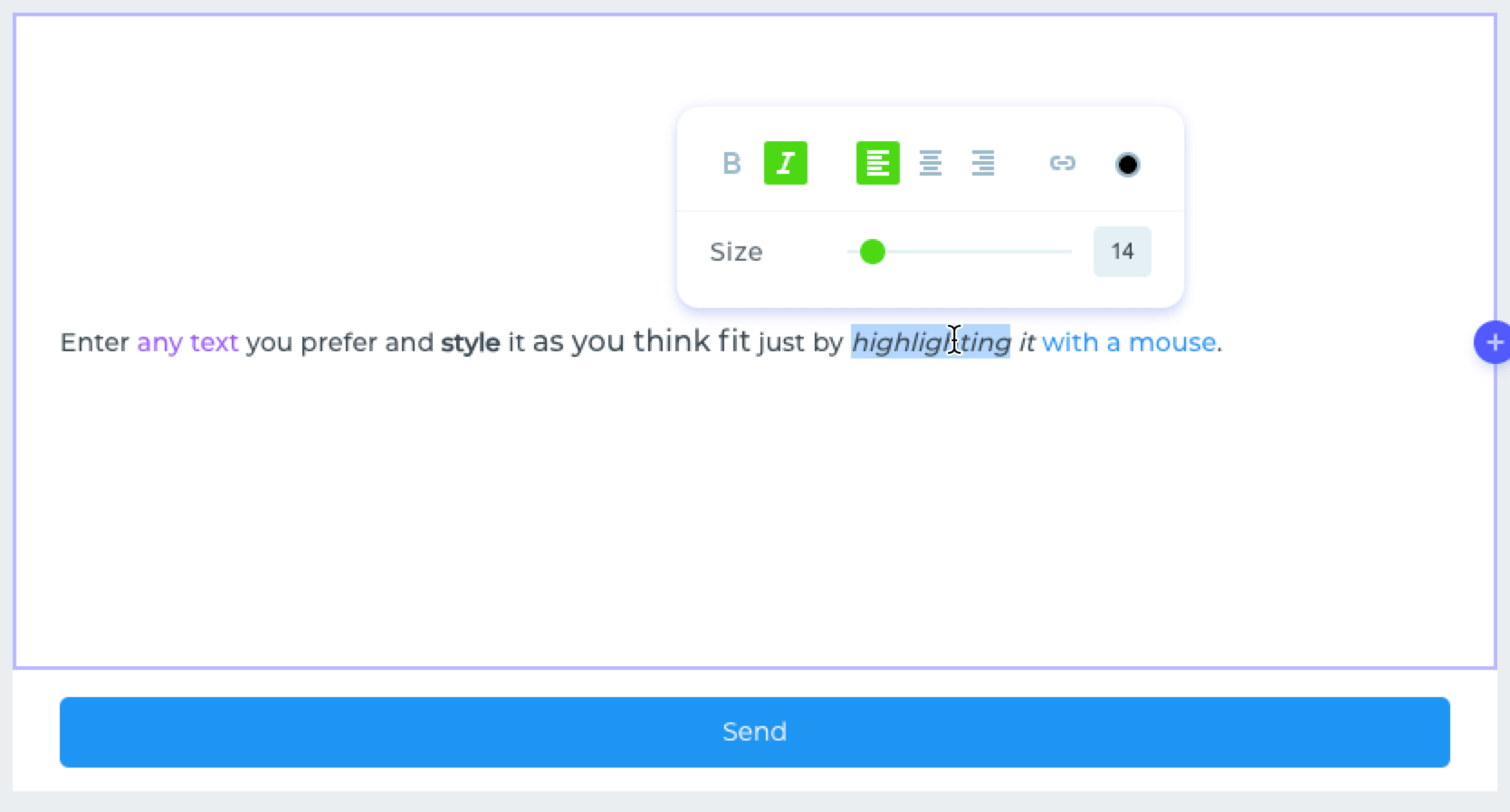
In the window that opens, there will be settings for applying bold text, italics, alignment, links in the text, color, and text size.
Code
This element serves as a place for hosting your own code: html, css, javascript.
You can learn more about the specifics of code integrations in this article.
This element is only available in the «Pro» plan.
For more details, visit the pricing page.
